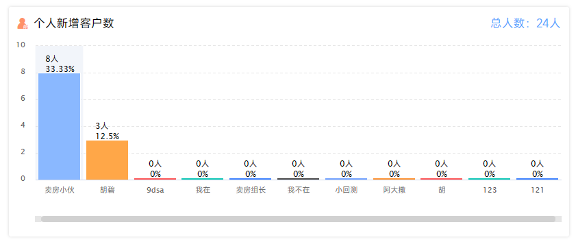
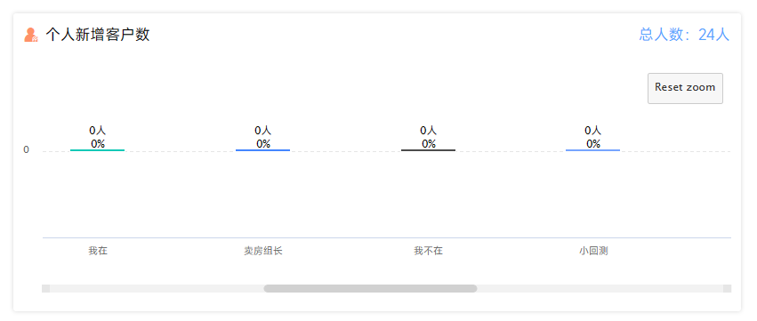
效果预览
直接配置
Highcharts使用柱状图,在x轴的数据太多的时候,不会出现滚动条而是挤压在一起,可以通过一些配置,给X轴添加上滚动条。
1chart: {2 type: 'column',3 zoomType: 'x',4},5scrollablePlotArea: {6 minWidth: 6007},8xAxis: {9 max:10,10 categories: data.categories, // 自定义x轴数据11 crosshair: true,12 labels: {13 autoRotationLimit: 100,// 设置倾斜的点14 autoRotation: [45], // 向右倾斜45度,默认为[-45]15 }11 collapsed lines
16},17scrollbar:{// 设置滚动条样式18 enabled: true,19 height: 8,20 barBackgroundColor: "#d1d1d1",21 barBorderColor: "#d1d1d1",22 rifleColor: "#d1d1d1",23 barBorderRadius: 5,24 buttonBorderWidth: 0,25 buttonArrowColor: "rgba(0,0,0,0)",26},如果确定数据量一定是大于xAxis.max条数的话,那你是可以这样直接写死设置的。
否则在数据不足够的时候,仍然会展示滚动条且highcharts会自动补齐数据项直到满足xAxis.max的数据量。
动态配置
为了满足在数据不足的时候,更加优雅的显示图表,建议自己判断数据是否需要显示滚动条。
1 let options = {2 colors: ['#77A5FF', '#FF9536', '#FF5858', '#14C9B7', '#4486FF', '#4c4c4c'],3 lang: {4 thousandsSep: ''5 },6 title: {7 text: ''8 },9 chart:{10 type: 'column',11 },12 credits: {13 enabled: false14 },15 legend: {57 collapsed lines
16 enabled: false,17 },18 xAxis: {19 categories: data.categories20 }21 yAxis: {22 maxPadding: 0.1,23 allowDecimals: false,24 title: {25 text: ''26 },27 gridLineDashStyle: 'dash',28 },29 tooltip: {30 enabled: false,31 },32 plotOptions: {33 column: {34 pointPadding: 0,35 groupPadding: 0.05,36 maxPointWidth: 62,37 colorByPoint: true,38 dataLabels: {39 enabled: true, //显示数量提示40 inside: false,41 useHTML: true,42 crop: false,43 overflow: 'none',44 y: 6,45 }46 }47 },48 series: []49}50if (data.length >= 10) {51 options.chart.zoomType= 'x'52 options.xAxis.max = 1053 options.xAxis.crosshair = true54 options.xAxis.labels = {55 autoRotationLimit: 100,// 设置倾斜的点56 autoRotation: [45], // 向右倾斜45度,默认为[-45]57 }58 options.scrollablePlotArea = {59 minWidth: 60060 }61 options.scrollbar = {// 设置滚动条样式62 enabled: true,63 height: 8,64 barBackgroundColor: "#d1d1d1",65 barBorderColor: "#d1d1d1",66 rifleColor: "#d1d1d1",67 barBorderRadius: 5,68 buttonBorderWidth: 0,69 buttonArrowColor: "rgba(0,0,0,0)",70 }71}72Highcharts.chart('element_id', options ) ; // 传入显示元素id和配置项使用这种方式可以在数据项不足的时候,使用原来的样式,在数据量大于max的时候使用滚动条样式。